An SAT micro-topic explainer. Free to read — no account needed.
A scatterplot plots pairs of values as dots to reveal how two quantities are related. Each dot is one data point, with its position set by the two values. The overall pattern of the dots tells you the relationship.
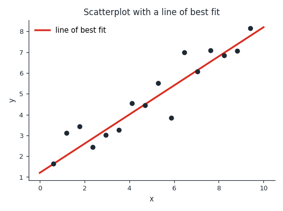
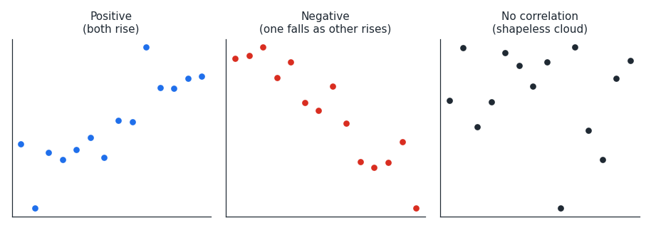
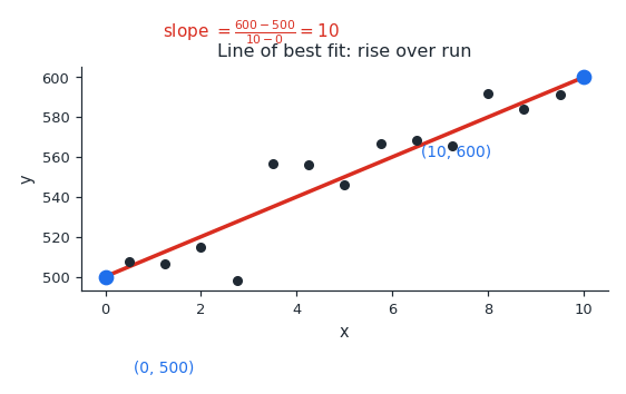
The figure shows a scatterplot with an upward trend and its line of best fit. Dots that climb from left to right show a positive relationship, or positive correlation. Dots that fall from left to right show a negative one, and a shapeless cloud shows little or no relationship.
The line of best fit passes as close as possible to all the dots. It does not have to touch any exact point; it captures the overall direction. Its slope tells you how fast one variable changes with the other.
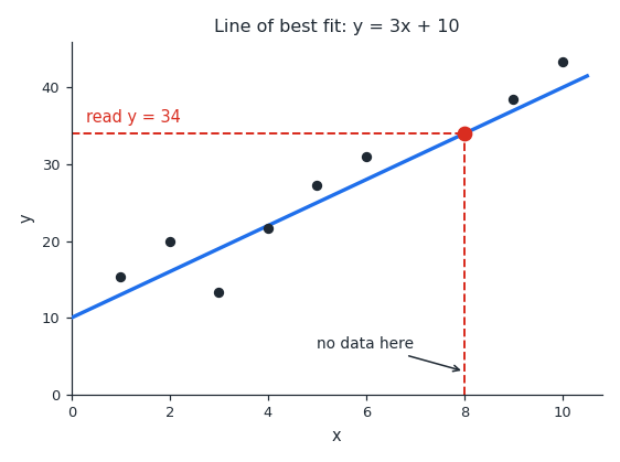
To estimate a value, read from the line rather than the scattered dots. Find your input on the horizontal axis, go up to the line, and read across to the value. This gives a predicted value even where there is no data point.
Worked examples
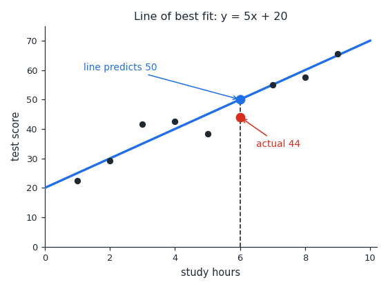
A scatterplot has a line of best fit y=5x+20. One actual data point is (6,44). Does the line overestimate or underestimate the actual value at x=6? Find the line's value at x=6: y=5(6)+20=50. The prediction 50 is higher than the actual value 44, so the line overestimates at x=6.
The line of best fit for a scatterplot is y=3x+10. Use it to predict y when x=8, where there is no data point. Substitute x=8 into the line: y=3(8)+10=34. So the predicted value is 34.
A scatterplot has a line of best fit that passes through (0,500) and (10,600). What is its slope? Slope is the change in y over the change in x: 10−0600−500=10100. So the slope is 10.
Is this one of the topics costing you points?
Take the free 10-question diagnostic for a predicted SAT score and a breakdown of which domains are costing you points.