An SAT Math micro-topic under Data representations (Problem solving and data analysis). Free to read — no account needed.
To catch a choice that misrepresents a graph or table, test its claim against the actual data, point by point. If the data disagree with the claim even once, the choice misrepresents the graph and can be eliminated.
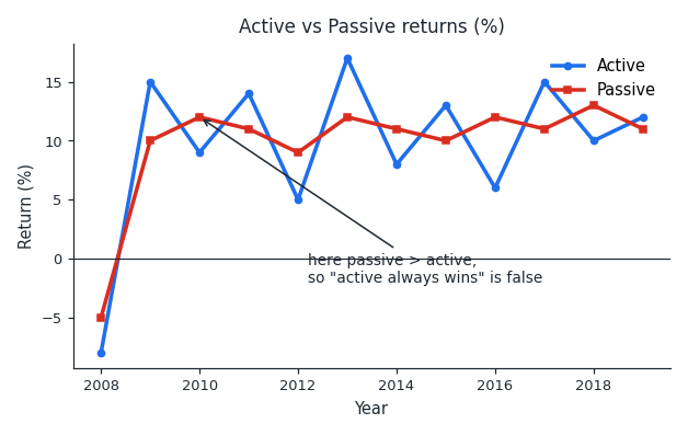
In the graph above, the active and passive lines cross over the years. Because they cross, neither line is always higher than the other. So a choice saying "active investing always outperforms passive" misrepresents the graph, since there are years where passive is higher.
Strong words are the easiest to disprove. "Always," "never," "every," "highest," and "lowest" each fall apart if you can find just one exception in the data. So scan for that one exception before trusting such a choice.
Also make sure the numbers themselves match. If a choice says a value stays "below 40" but a bar clearly rises above 40, the choice misrepresents the data, no matter what the overall trend looks like.
Worked examples
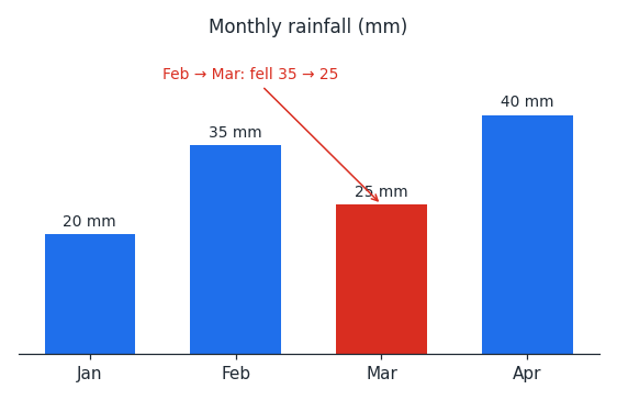
A bar graph shows a town's rainfall for four months: 20 mm in January, 35 mm in February, 25 mm in March, and 40 mm in April. A choice says, "The rainfall increased every month." Is this accurate? No — from February to March the rainfall fell from 35 mm to 25 mm. Because the graph shows a drop, the claim "increased every month" misrepresents the graph.
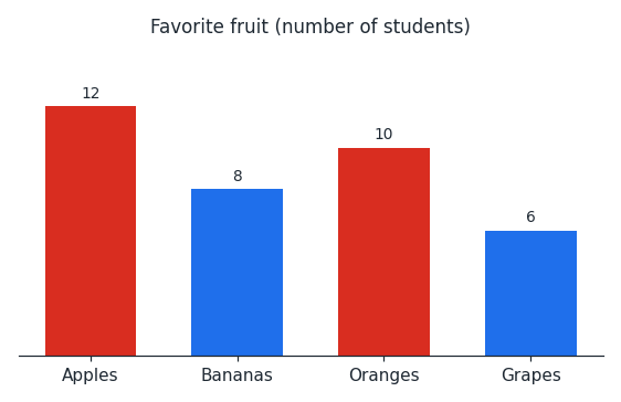
A bar graph shows how many students chose each favorite fruit: 12 apples, 8 bananas, 10 oranges, and 6 grapes. A choice says, "More students chose oranges than apples." Is this accurate? No — apples were chosen by 12 students and oranges by only 10. Since apples are higher, the choice misrepresents the graph.
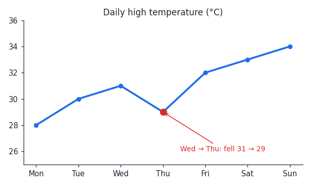
A line graph shows the daily high temperature for a week, rising from 28 degrees on Monday to 34 degrees on Sunday. A choice says, "The temperature rose every day." Is this accurate? No — from Wednesday to Thursday it fell from 31 degrees to 29 degrees. Because of that dip, the choice misrepresents the graph.
Is this one of the topics costing you points?
Take the free 10-question diagnostic for a predicted SAT score and a breakdown of which domains are costing you points.