Basic Data Interpretation
An SAT Math micro-topic under Center, spread, and shape of distributions (Problem solving and data analysis). Free to read — no account needed.
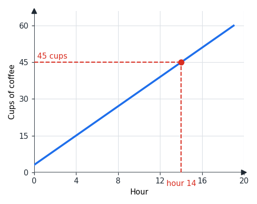
Most data-interpretation questions test a single skill: reading a value off a chart accurately. To find the value of the graph at a particular input, trace up from that point on the horizontal axis to the curve, then straight across to the vertical axis.
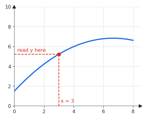
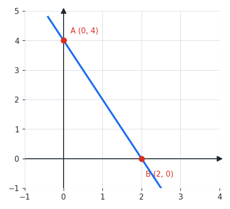
In the figure, to read the value at you go up to the curve and across, landing at a of about . The same approach reads the coordinates of marked points: a point on the -axis has , and a point on the -axis has .
Trends and extremes are read the same way: an upward-sloping graph shows an increasing quantity and a downward slope a decreasing one, while the highest and lowest points give the maximum and minimum.
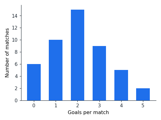
Charts come in several forms, but the locate-and-read method is the same. A bar graph shows each value as the height of a bar, so reading it means comparing heights or finding the tallest or shortest.
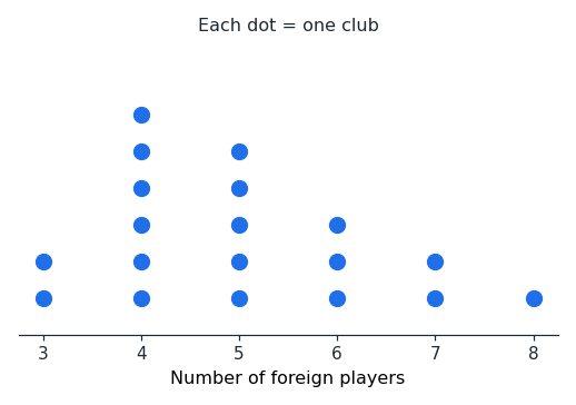
A dot plot stacks one dot per data point above each value, so the height of a stack is its frequency; counting dots gives totals and helps locate the median.
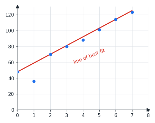
A scatterplot shows individual data points, and a line of best fit is the straight line that best follows their overall trend. The line need not pass through every point: predictions are read from the line, not from the scattered dots.
Worked examples
A line graph plots cups of coffee against the hour. To find the value at hour , go up from to the line and across to the vertical axis: the -coordinate is , so cups.
A line crosses the -axis at one point and the -axis at another. The point on the -axis must have , so it is ; the point on the -axis must have , so it is .
A line of best fit is drawn through a scatterplot. To find which points lie on it, read the line itself, not the data: here the line passes through , , and . The point is a data point but sits just off the line, so it is not on the line of best fit.
Is this one of the topics costing you points?
Take the free 10-question diagnostic for a predicted SAT score and a breakdown of which domains are costing you points.