Box plot
An SAT Math micro-topic under Center, spread, and shape of distributions (Problem solving and data analysis). Free to read — no account needed.
A box plot, also called a box-and-whisker plot, is a compact way to show how data is spread out. It marks five values along a number line: the smallest value, the first quartile, the median, the third quartile, and the largest value.
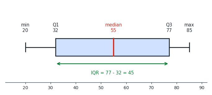
Read the plot above from left to right.
The end of the left whisker is the smallest value ().
The left edge of the box is the first quartile ().
The line inside the box is the median ().
The right edge of the box is the third quartile ().
The end of the right whisker is the largest value ().
The end of the left whisker is the smallest value ().
The left edge of the box is the first quartile ().
The line inside the box is the median ().
The right edge of the box is the third quartile ().
The end of the right whisker is the largest value ().
So the box stretches from the first quartile to the third quartile and holds the middle half of the data, while the two whiskers reach out to the smallest and largest values.
Worked examples
A box plot has its left whisker at , its first quartile at , its median at , its third quartile at , and its right whisker at .
What are the smallest value, the median, and the largest value?
The whisker ends give the smallest value and the largest value , and the median is .
What are the smallest value, the median, and the largest value?
The whisker ends give the smallest value and the largest value , and the median is .
A box plot has its left whisker at , its first quartile at , its median at , its third quartile at , and its right whisker at .
What are the first quartile and the third quartile?
The first quartile is and the third quartile is .
What are the first quartile and the third quartile?
The first quartile is and the third quartile is .
Is this one of the topics costing you points?
Take the free 10-question diagnostic for a predicted SAT score and a breakdown of which domains are costing you points.